QuickBooks Hero

QuickBooks

UX/UI Design

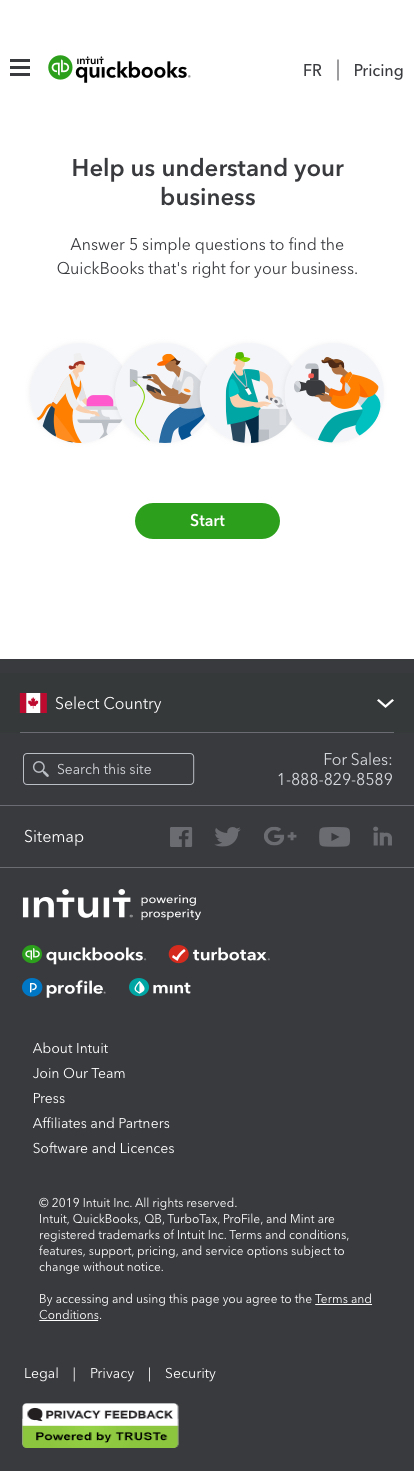
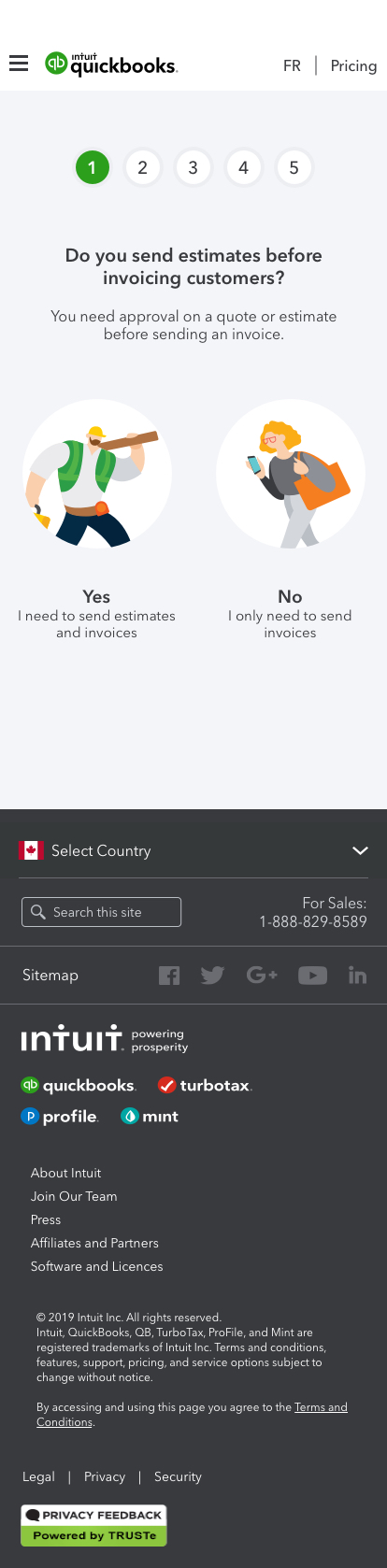
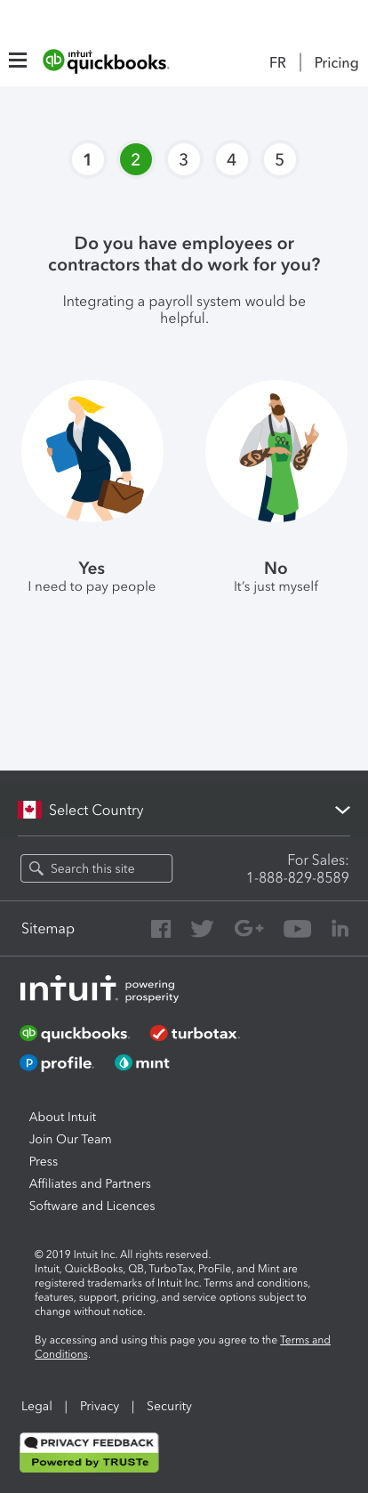
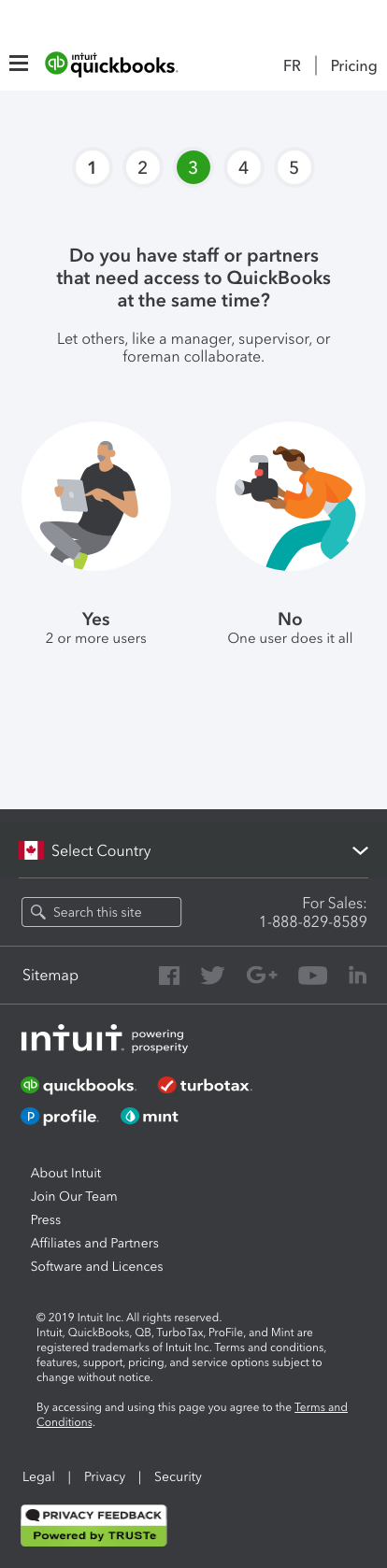
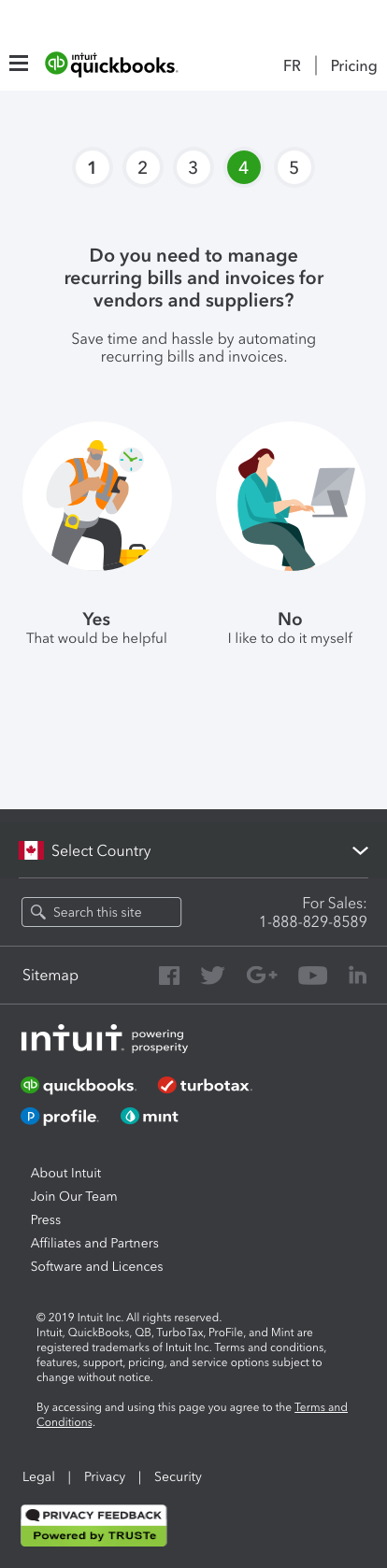
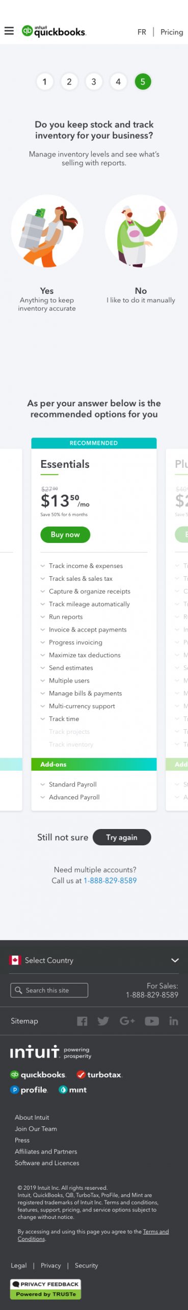
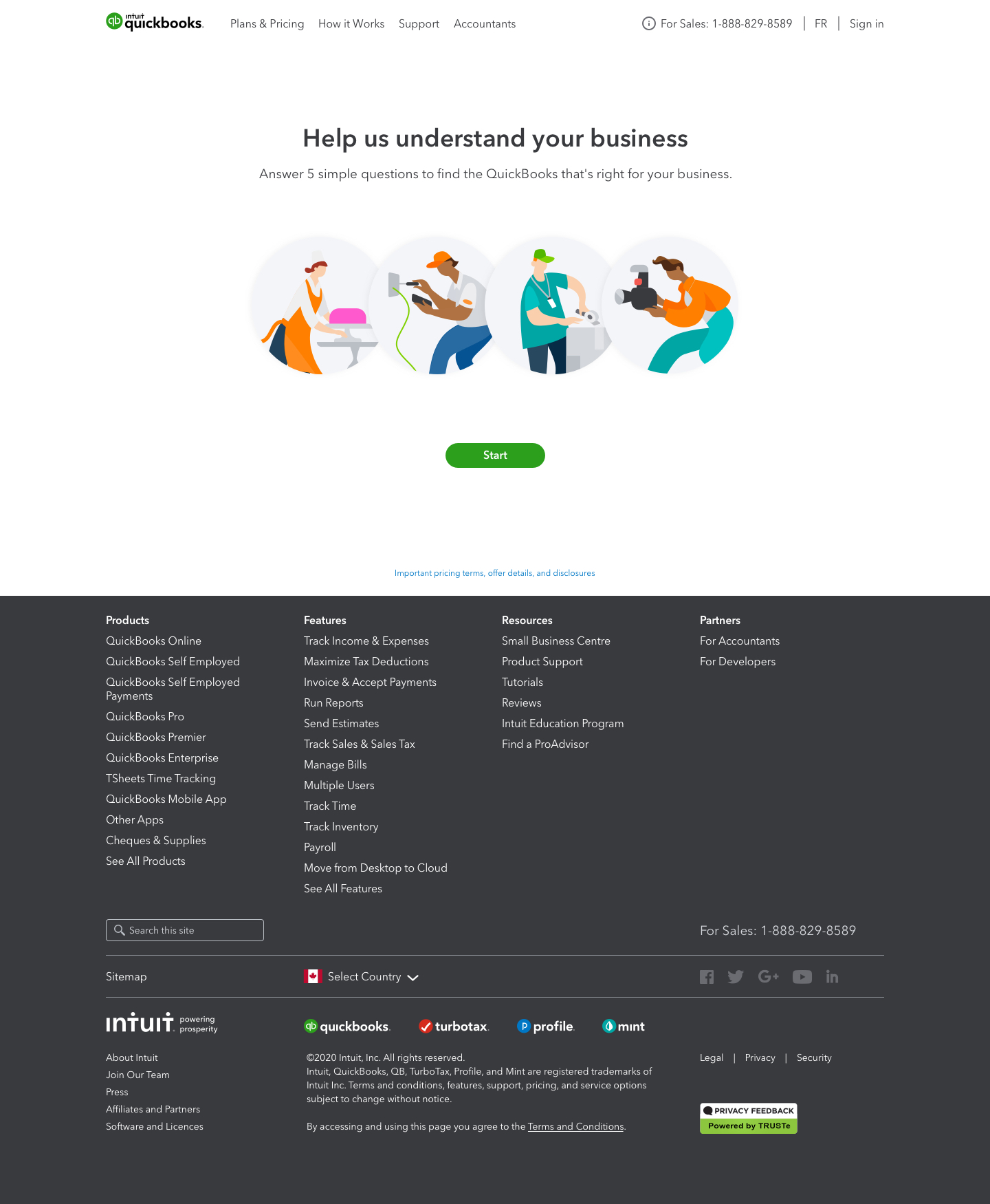
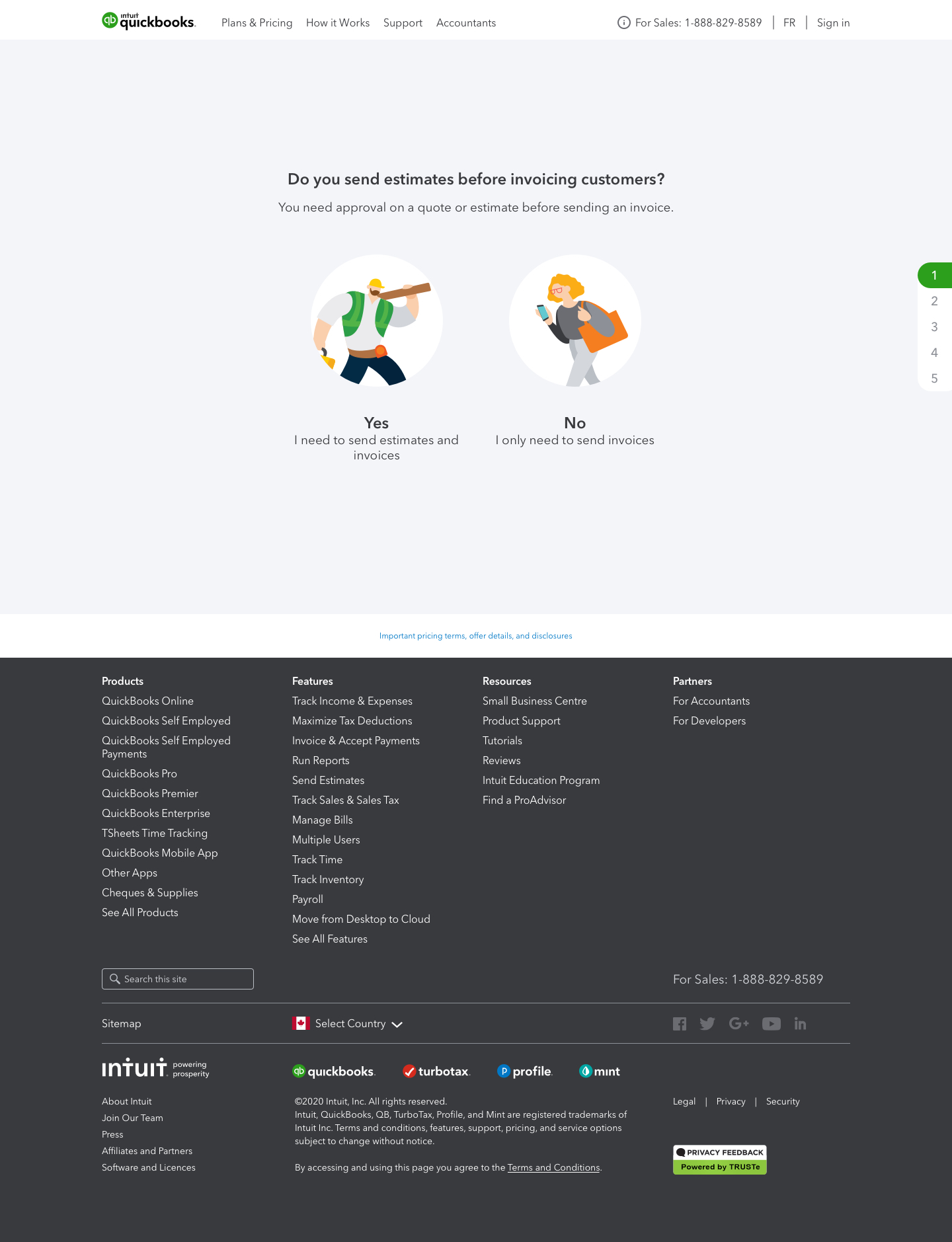
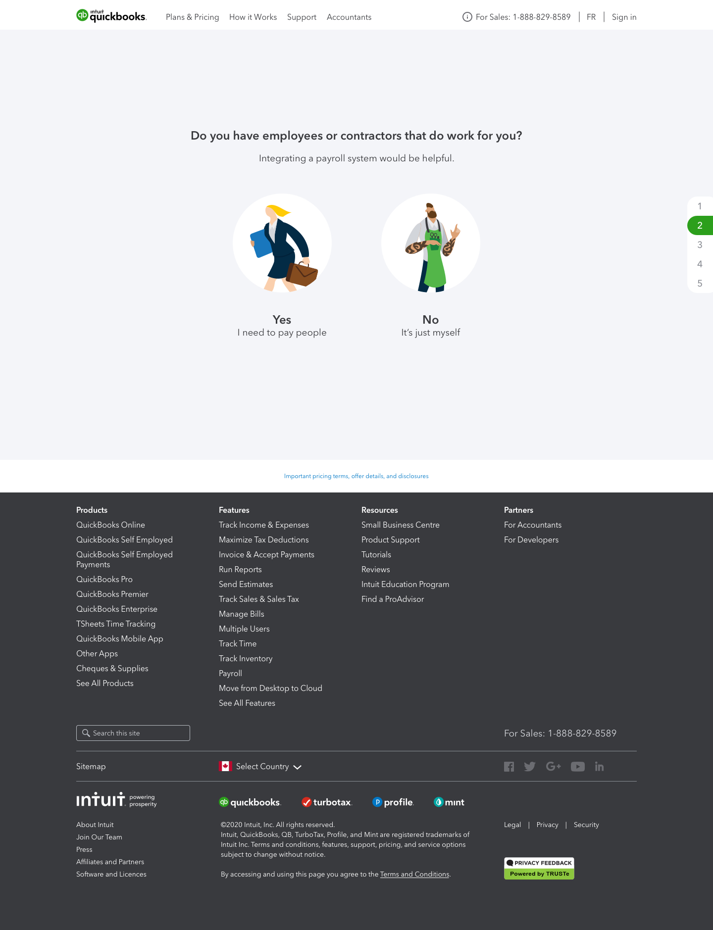
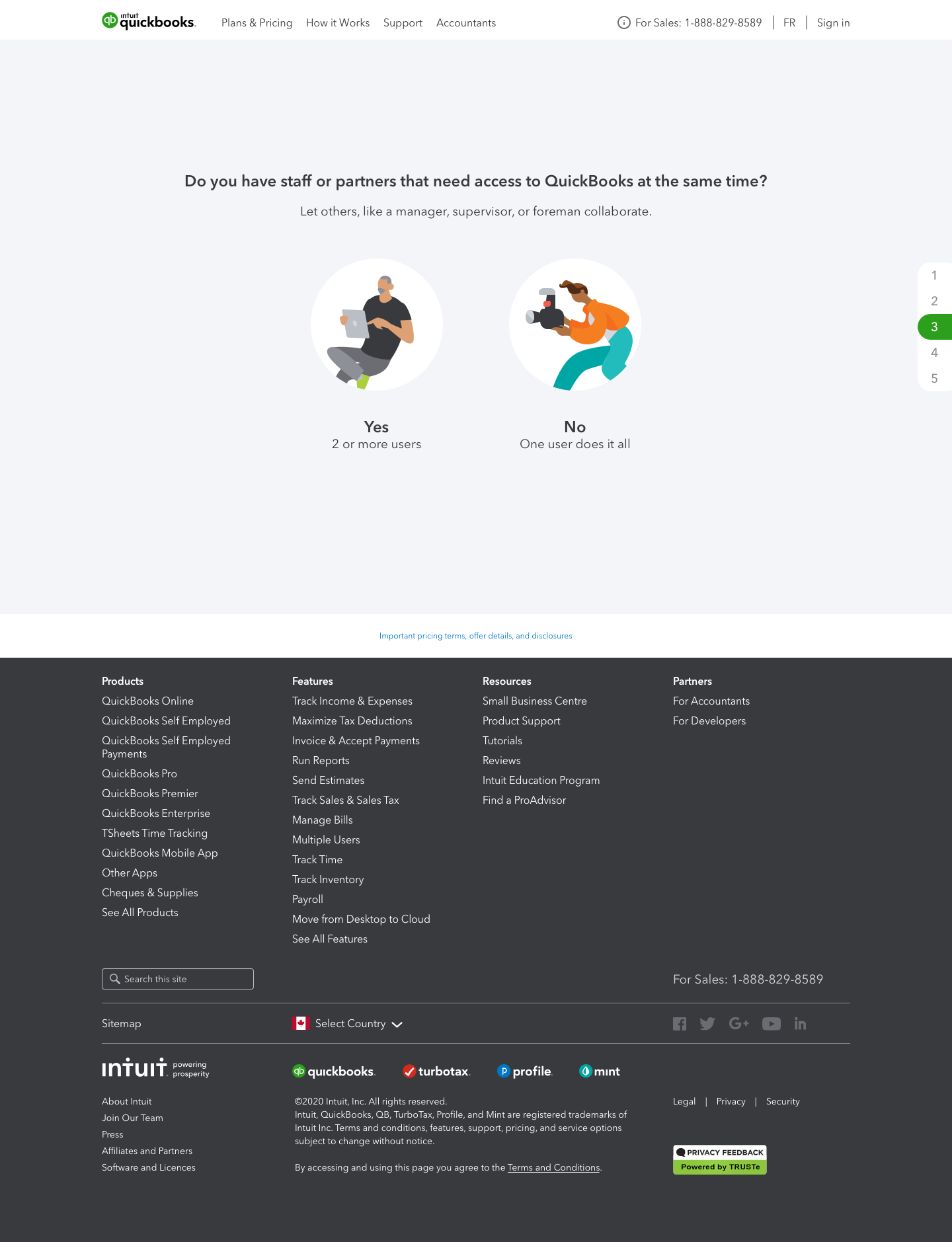
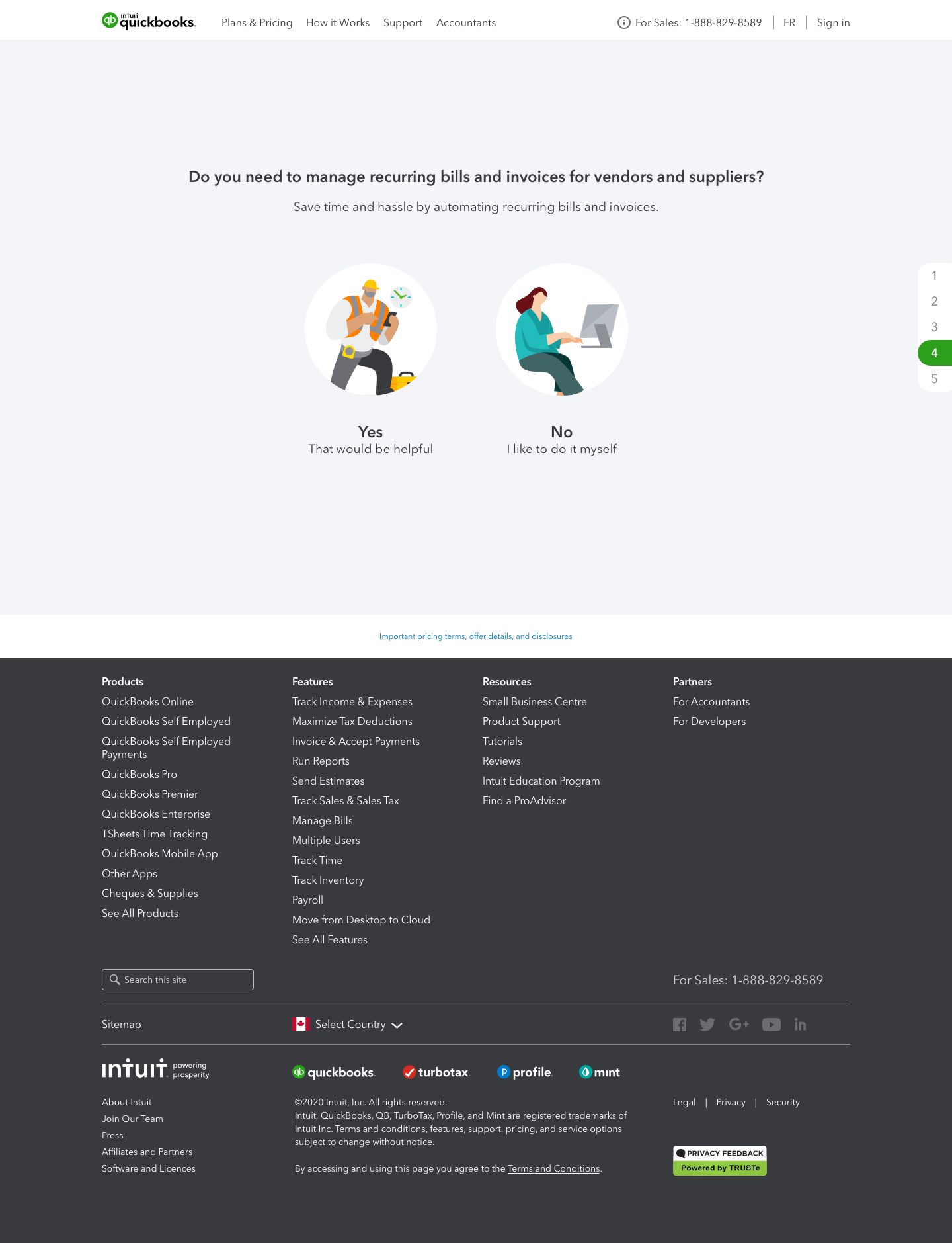
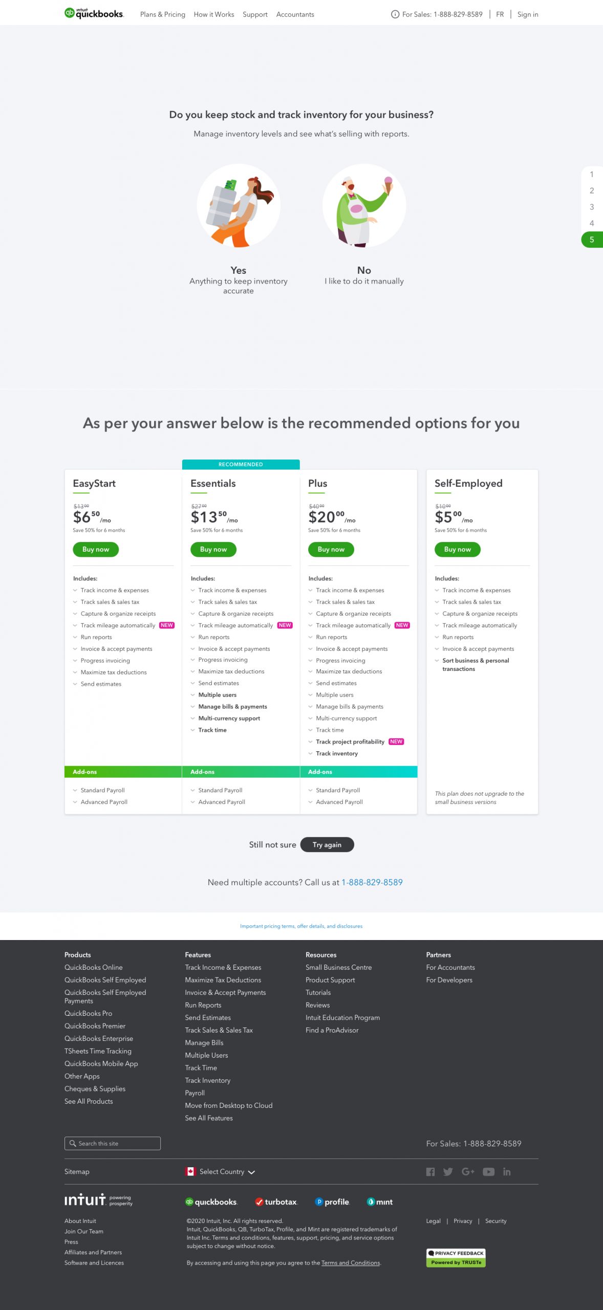
I joined Intuit in mid-2019, I was hired to work on revamping the QuickBooks Canada product and marketing website, a website which will allow self-employed, small businesses, enterprise and accountants to not only get information on the features but to get training and buy a #1 accounting software in Canada. After I joined the team, I was not just revamping the website, I was working along with the product and marketing team to promote and make the buying experience more engaging. Which lead to Intuit’s design motto – Design for Delight aka D4D.

Device: Responsive Design
Project involved: Icons, Mock ups, UI design, HD Video rendering and publishing
Project Name

Product Selector

GOAL

To help customers to choose and assist them in buying the appropriate QuickBooks package for their accounting needs. Increase our signup and decrease our fall-outs.

Team

We were 3 designers – two senior designers (me + 1) and one junior designer, a content writer, 5 developers, and a UX researcher. Ours was a full-stack team and followed an agile framework, where our sprints were 2 weeks long and had daily standups where we will discuss what we are working on and if there were any impediments for the task.

Strategy

From the get-go, we saw an opportunity to add some UX enhancements to what other geo’s (Australia) had done. Our strategy was to recognize customers’ confusion when they were on the pricing page, where they were offered different packages of the software. And then identify their prioritizes and business requirements, test our hypothesis and provide a better user experience.

Research

Iteration planning

We had some data from the research which was done by the team in Australia for the QuickBooks Australia website. Based on their findings we decided to do our own content and design research. We wanted to test our hypothesis – that we will test two options, first where we will show the entire questionnaire on the page for the user to answer when the user clicks a button to suggest the package we will tag/highlight the recommended package. The second option was not to show the entire questionnaire but to show a new question every time when he answered the current one.

From our data and cross-reference, we decided that we will go with the second option as users were able to give correct information and not choose the package they wanted, but agreed on what system recommended them on answers they provided.

`` We took an unbiased approach of
research, design, testing, and defining everything
from content to design.``

Persona

We interviewed quite a lot of people, our researchers were able to gather rich information from there FMH – Follow Me Home sessions. To properly validate user flows and unique interactions we decided to create multiple personas. Based on interviews and research, we created personas for Self-employed, Small Business as well as Accountants and Mid to Enterprise level users.

I did not want to have our findings to just our team but wanted to spread the word around the entire office. So, we decided to print them on 6’x2’ ft poster and hung them in high traffic areas like kitchen wall, corridors of the office. Everyone from development, implementation, sales, and marketing as well as VP and Director noticed and liked the initiative to spread the buzz to know the customers and identify their pain points.

uparrow
This persona templates that I created was
highly accepted and eventually, it was decided
to be used in entire Canada and the UK offices.

Design

Task-flows & Wireframe

When a user was on a Pricing page he/she will see a banner, that would suggest that we can help me find a correct package. Task-flow was simple.

Homepage > Pricing > Questionnaire > Buy now

Due to the QuickBooks global design system, we were able to produce a design solution very quickly. However, with this new design, few new components had to be developed. As per the QuickBooks design system requirements, these new design components had to be scalable, consistent, and efficient for better outcomes and integrate well with our UI Library.

Mockups & Wireframes

After we understood the basic flow, I created multiple wireframes and Lo-fi’s. I included content writers, fellow designers, people from the marketing team to run down the designs and flow. This helps me understand other people’s points of view and their thoughts about the possible design solution.

Designed multiple variations

From the mockup and wireframe session unanimously it was decided to create 2 sets of designs and we would A/B test them to validate our hypothesis.

Design A

To minimize the development time I decided to use the pre-developed component from our design system, this design option had a light grey background and show our users how many questions they will have to answer. At the completion of the questionnaire, the user would be shown a price package with the recommended tag again as per our design system.

Design B

I decided to show the questionnaire in a card format with a slider. One of our hypotheses was, what if the user answered a question, and the rest of the questions were not required – by using slider we can cut short the questionnaire and show them a recommended package in a different treatment. My design only showed a recommended package with an option to see and compare all the packages.

Prototype testing

Moderated testing

The goal was to capture user emotion and get feedback when they were using the tool. I did multiple user-testing sessions, where each user would first use mobile design and then a desktop version.

Findings

Design A

Users found the mobile option better compared to desktop. However, when the pricing package options were shown, users got more confused and could not identify the recommended pricing package. Users pointed out that this option was not clear enough to highlight the recommended package.

Design B

Users found this design better both on mobile and desktop. They liked how the recommended package was shown and if they wanted to compare it with other packages they could. Most of the users found design option B more clear and likely to use.

uparrow
Users found this design better both on
mobile and desktop, they liked how the
recommended package was shown at the end.

Hand-off

Created a detailed document that explained the interaction and animation between the questions. Having designed the mobile-first experience, developers found it easy to build for other viewports. Zeplin and InVision interactive prototypes made it easier for developers to comprehend the transition and interaction on the page.

Moving forward

We were going to have heatmap and other analytical tools embedded on this page to measure the completion, time-taken to finish the questionnaire, and any fallouts from the page.

Future enhancement

It was decided that once we learn more from our findings, we will add more interactive functionality as well as make it available to other geo’s.