Koodo Mobile

UX/UI Design

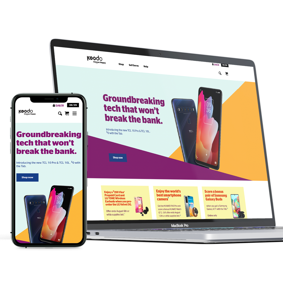
Koodo eCommerce website with around 40,000 unique visitors a month to buy mobile phones and compatible wireless plans. With mobile-first and user-centered design, I was a team lead who manage Koodo’s eCommerce digital experience. During my tenure, I helped developed a Design system for Koodo, designed and developed personas, journey mapping, guerilla user-testing, moderated as well as unmoderated usability testing on mockups. Critiqued and help fellow designers in the show-n-tell session, as well as kept management and leadership updated on the product roadmap.

Device: Responsive Design
Project involved: Icons, Mock ups, UI design, HD Video rendering and publishing
Project Name

2 Step Authentication

Objective

To stop online fraud orders, we assumed that an estimated $200,000 worth of Apple iPhone, Samsung, and other high-end smartphones we ordered online and sold privately.

Selected Project

Below is one of the many projects that I worked on at Koodo.

Team

Leader designer (myself), 2 developers, PM, QA

Research

Getting to know the users

We came to know about this fraud from our Marketing and Frauds department. After careful investigation, we figured out that few existing customers found out the loop in the system and were gaming the system.

Perceptions – Finding

We found that when an order is placed from the sub-account of the multi-account customer. The primary account holder would not get any intimation about the order placement for the new devices. Which resulted in bad credit for the primary account holder.

Solution

After understanding the current flow and consulting with the engineering team, we decided to go with Google’s 2-factor authentication. With this technology, we were able to implement a seamless and frictionless solution to our existing flow within mater or days.

The majority of people today own a smartphone. The solution will therefore naturally materialize through a mobile phone, it will be quick one the order was placed from sub-account, the primary account holder would get a notification and would have to authenticate and accept the notification to proceed with the order.

Persona

We had to revisit our existing personas. The 2 personas are established in the context of the scenario of primary and secondary accounts. It must then be taken into account that the majority of people who opened multi-account were limited to their family and friends.

Pascal-Profile picture
Pascal, 54 years old

He is a farmer and married, as two kids and a dog in a country village. Apart from farming his activities are watching the news and walking his dog once a day around his home. He is not so tech-savvy person, hardly uses his cellphone. He likes to socialize and likes to pay his bills by going to the bank.

Camille-Profile picture
Camille, 18 years old

She is doing a diploma in communication, from the University of Alberta. She is lives with her friend in an apartment near the city center. She works for a company which is in the suburb and has to travel to work by local transport. She watches her show and surfs the internet while commuting. On her free days, she likes to go for a long run with her music. She uses her mobile data almost every month and is in the market for new smartphone and better wireless plan.

Design

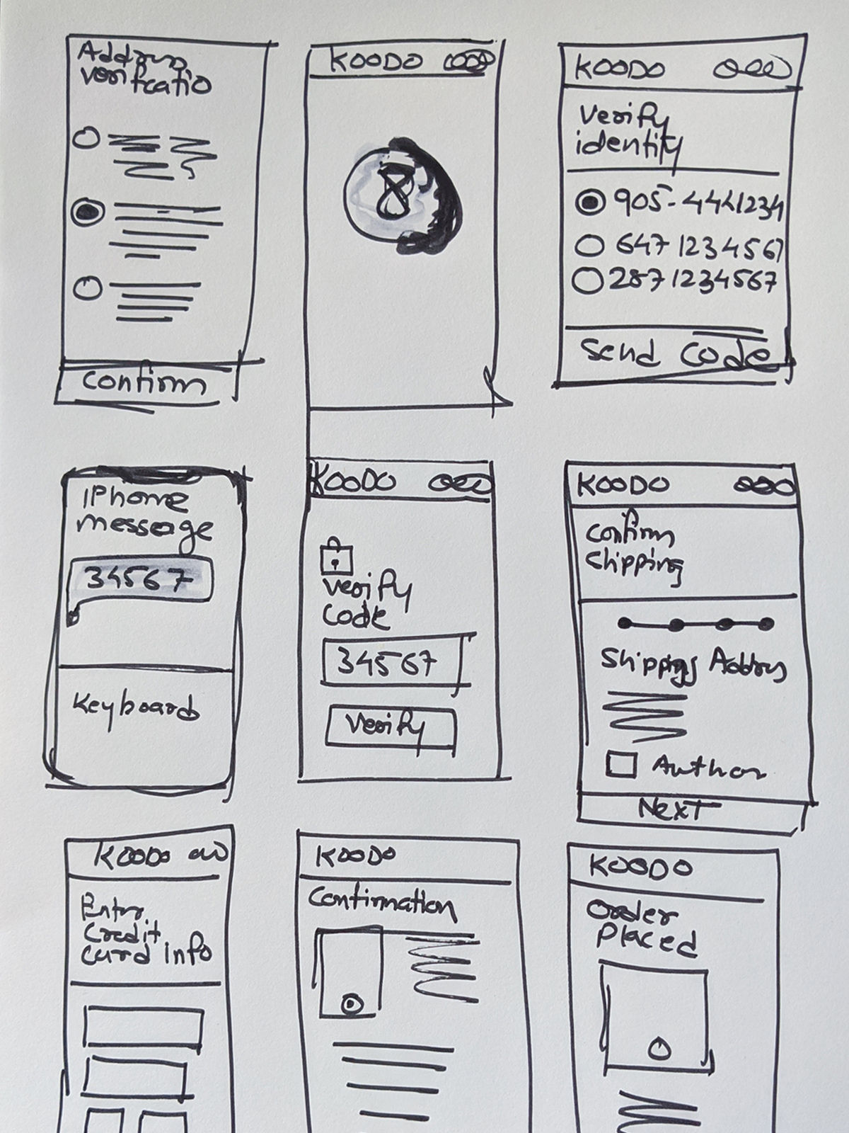
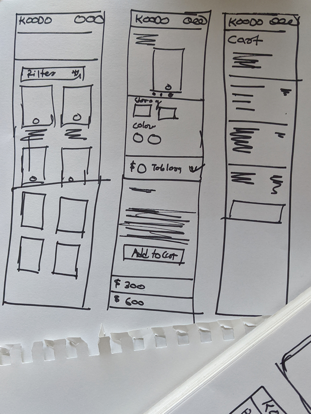
Wireframes & User-flows

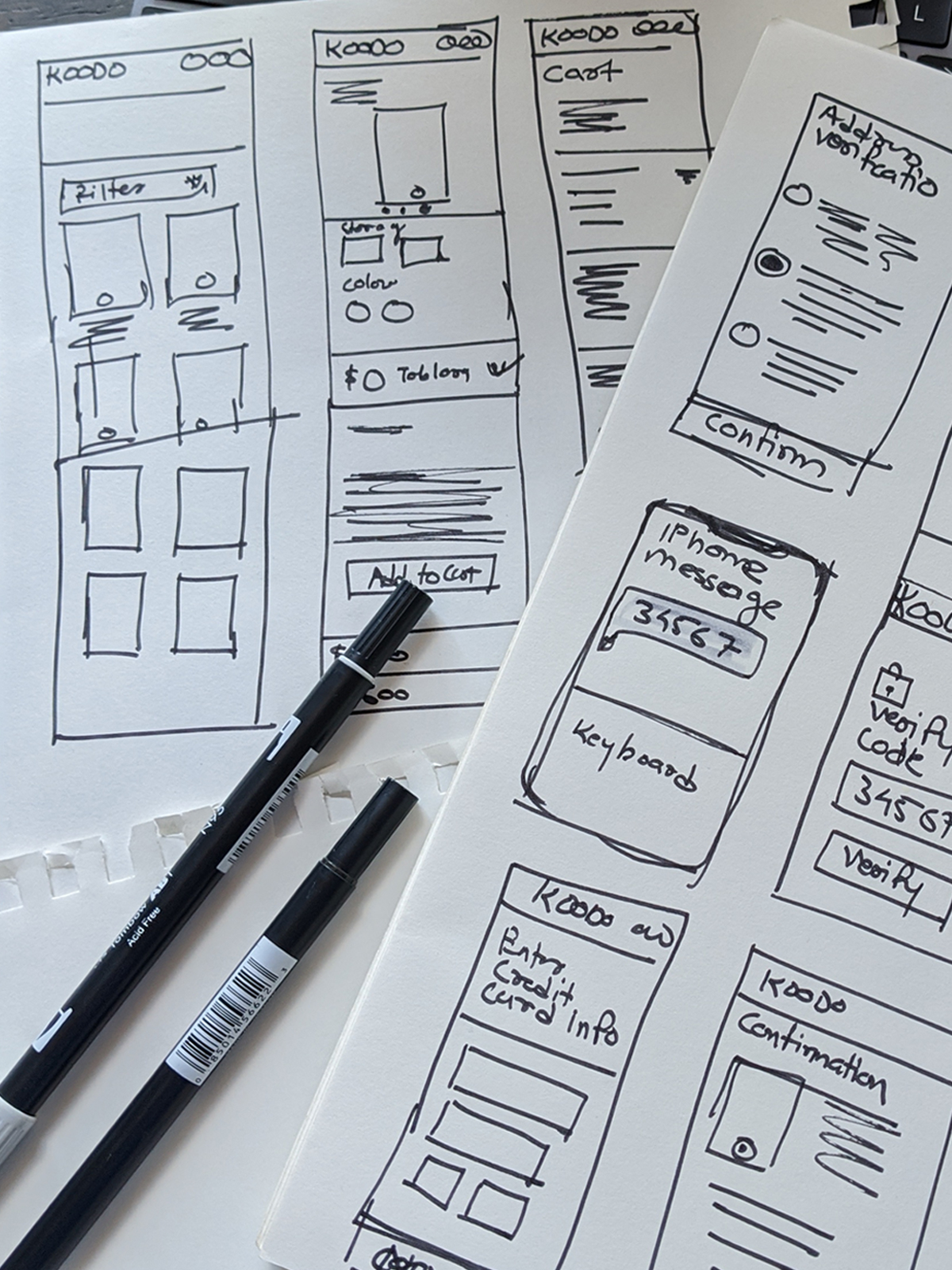
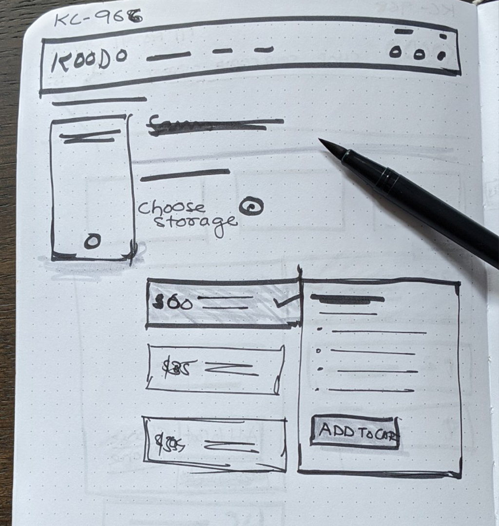
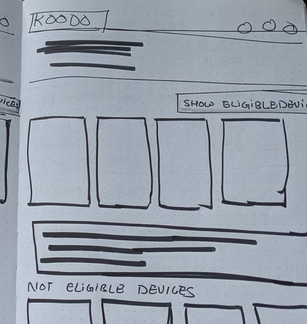
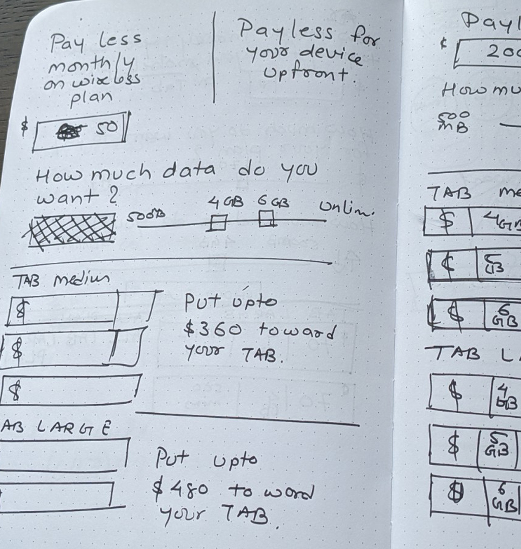
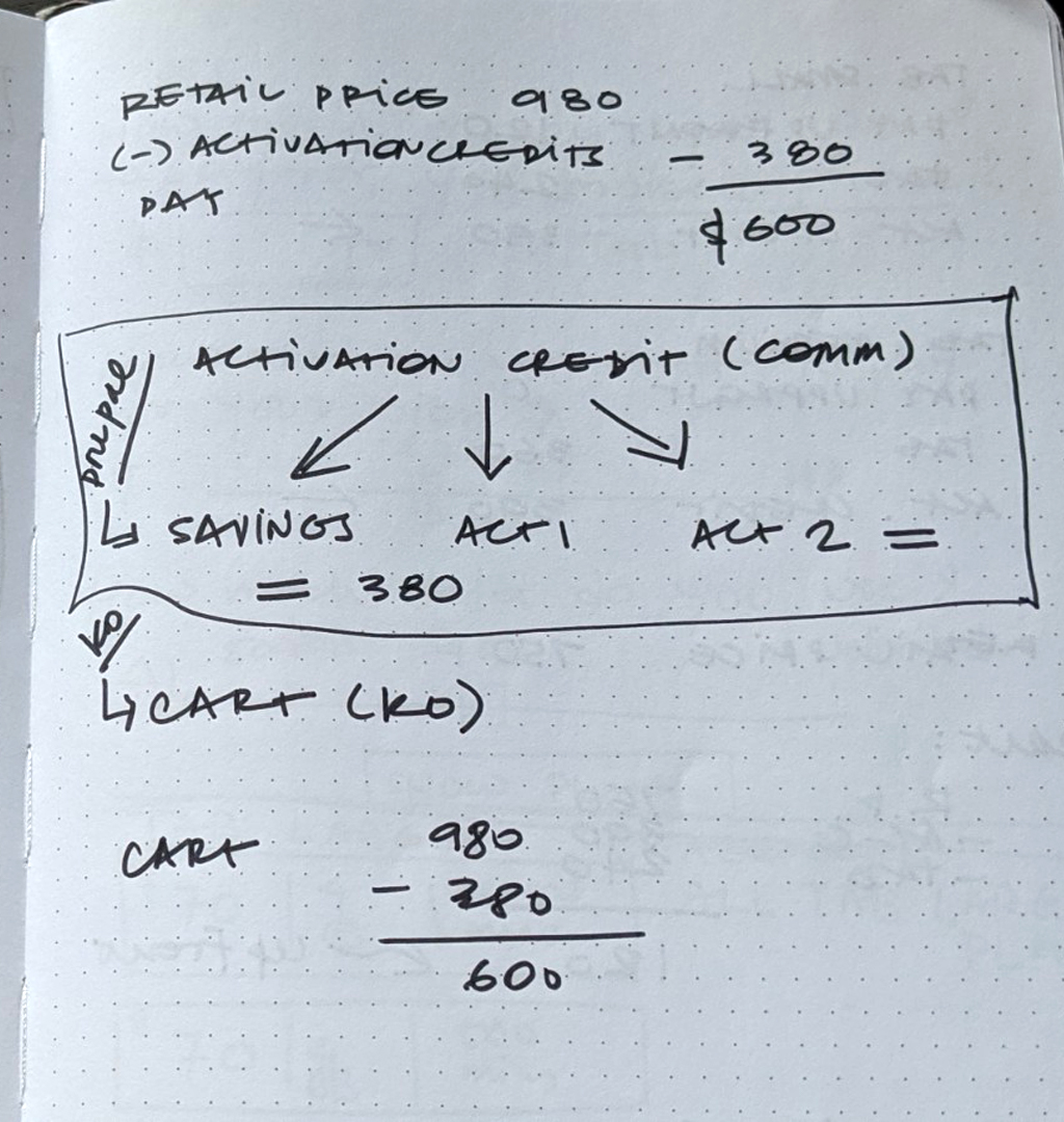
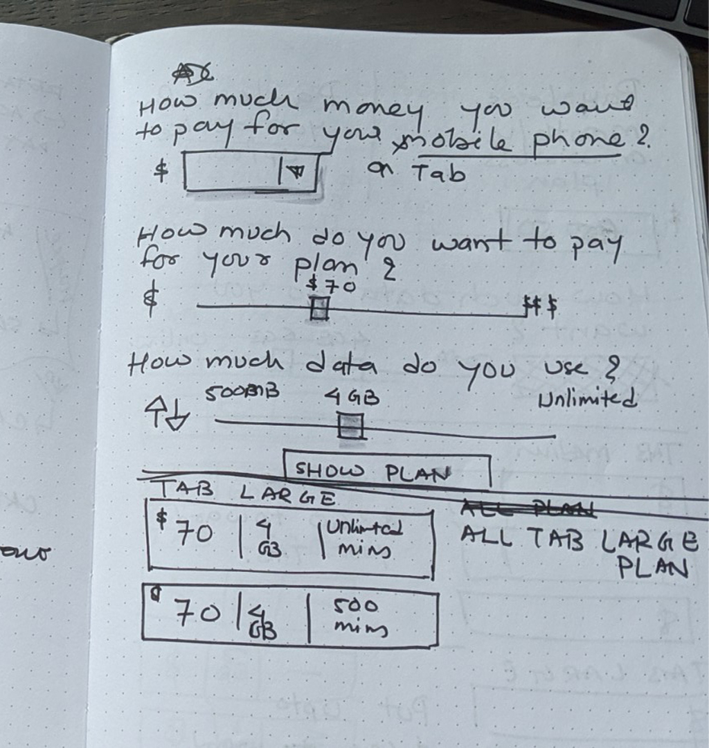
You can see a few of our brainstorming session notes and sketches.

To understand more about the user flow and how would the new solution fit in I created user flow.
Below is the comparison between the two flow.

User journey

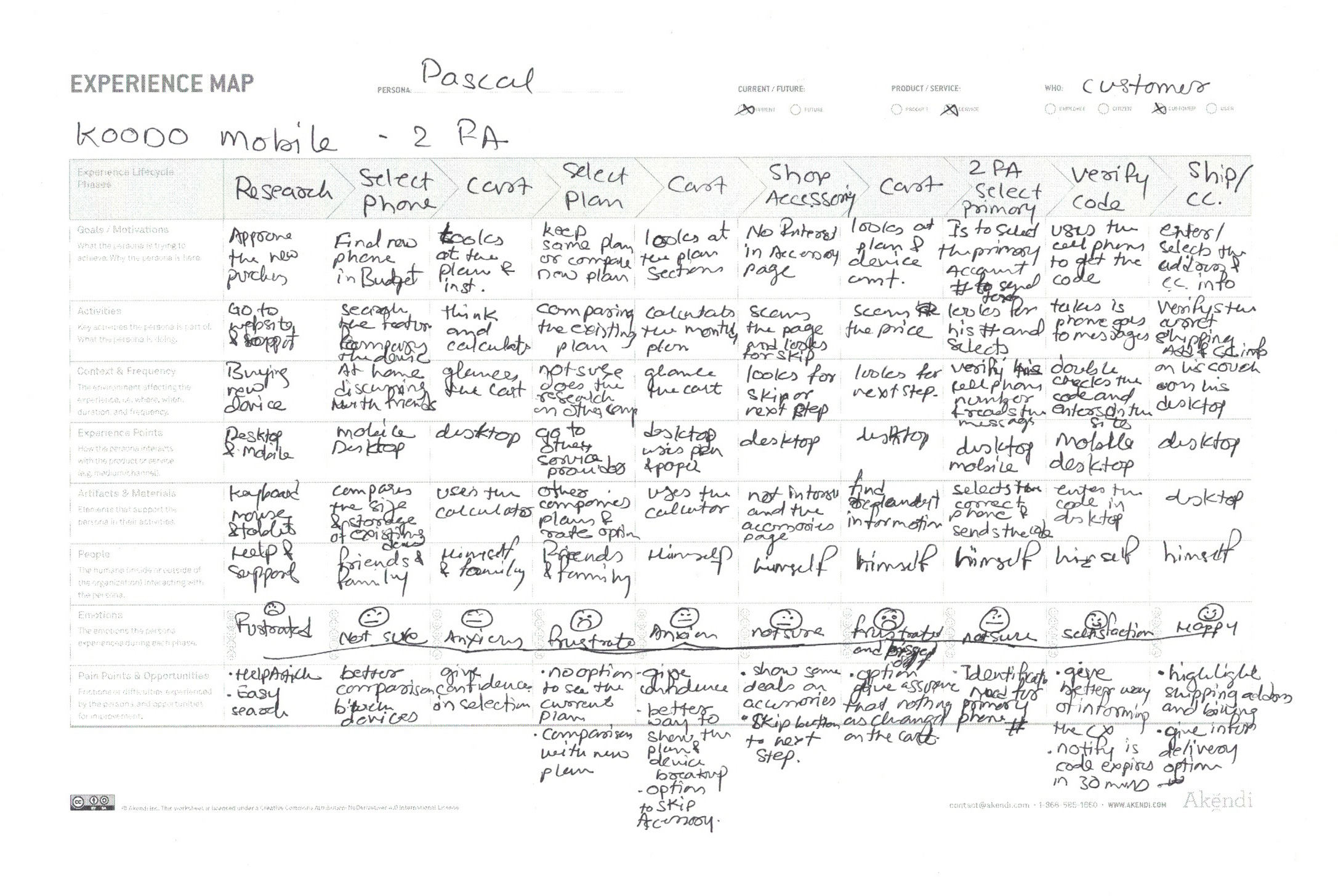
I wanted to capture the user’s emotions when placing an order, hence I created a user journey.

Prototype Testing

Method:

Unmoderated interview to find out if clients were confused about the flow of the first step, and observe how they reacted.

Findings:

Indeed there was some confusion as to the purpose of the initial flow. For the most part, users were comfortable with either and didn’t seem to have concerns with the security feature.

Above is the 2 Factor Authentication flow after it was launch.

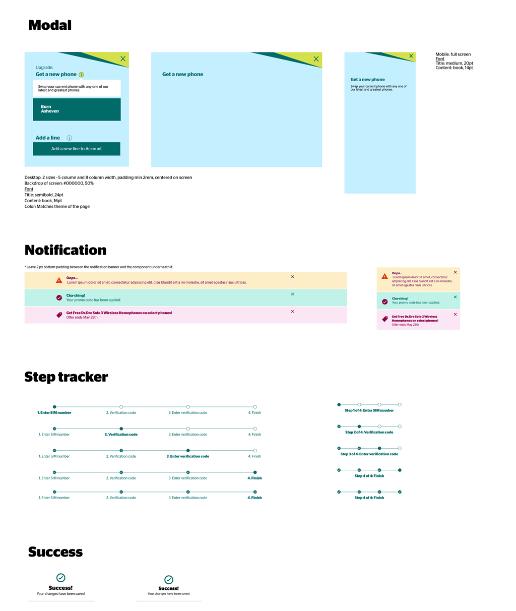
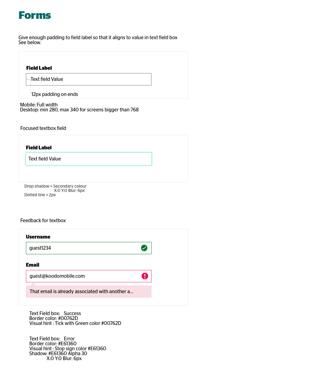
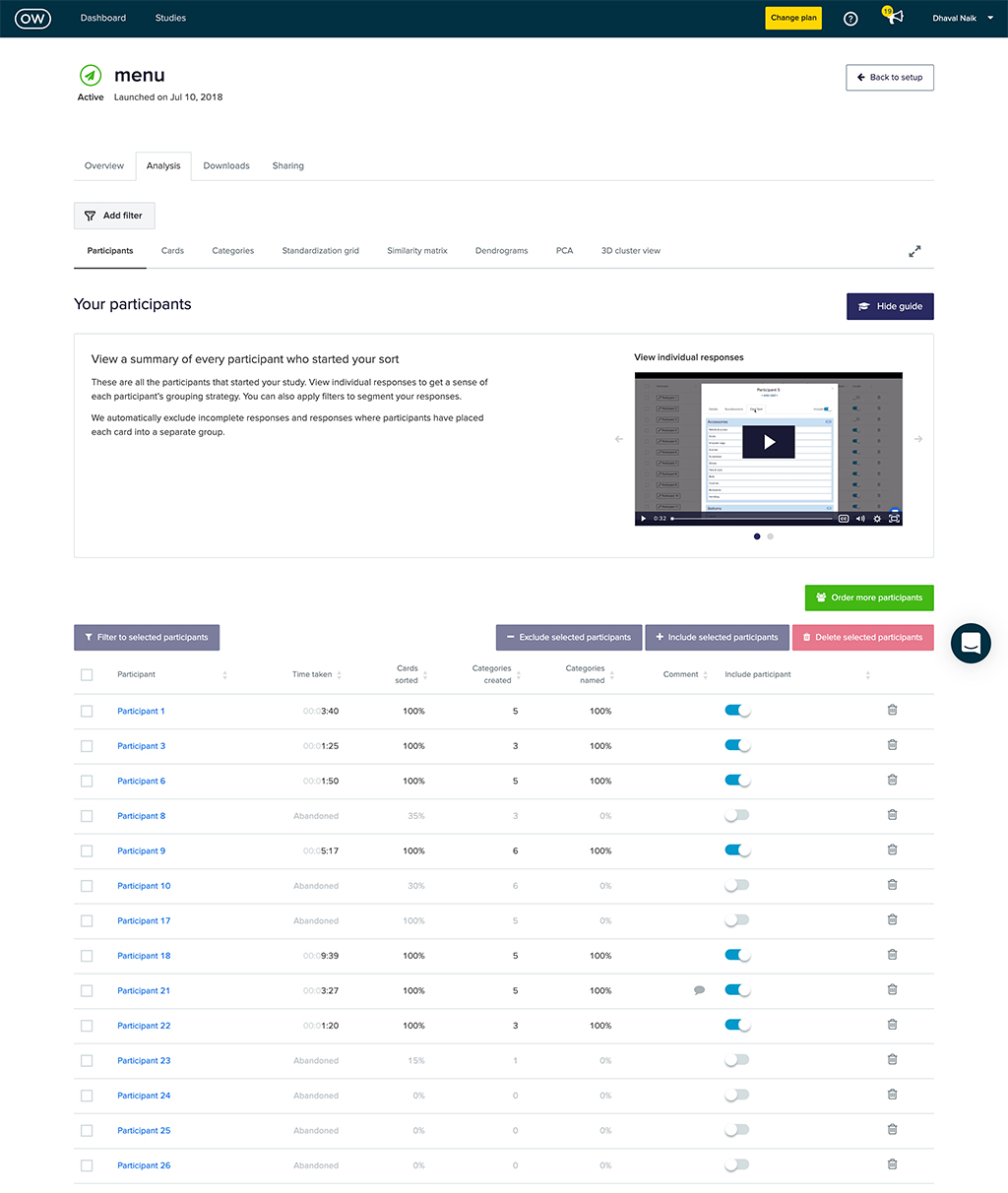
Above are a few of the Koodo Design system screens, as well as the Optimalworkshop screens.

Hand-off

After our usability testing and tweaking our design, we would go thru the final show-n-tell session were leadership, marketing, and other teams would see what is expected to come in the market.

A proper design spec document will be given to devs for the hand-off. Once the page is ready, I will do a visual design inspection and will assist QA to see if there was no issue while testing.

Moving Forward

Future enhancements

The next step was to create a support and how-to page for this new feature. We communicated our customers via email and account notification regarding this new security feature. Developers were also going to add another security by way of limiting the user time session.

Analytics

We wanted to track the drop off on the unsolicited users with 2-factor authentications, so I recommended tracking time-spent in each section, especially the 2-factor page (to see if users are dropping off through the flow). We also asked for a heatmap on the page, where we think there is the most opportunity for improvement.